PERSONAL PORTFOLIO

SEMESTER 2


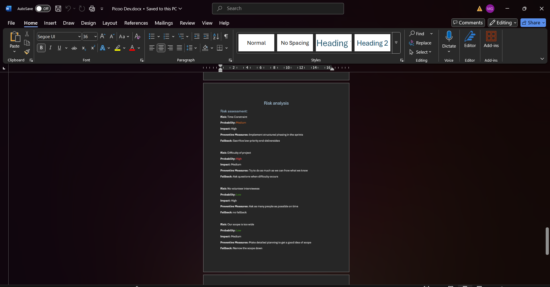
For the third project of semester 2 the class was split into groups, and we had to developed the designs that we created with the previous project. Me and my group started with the documentation by making a project plan which consisted of the steps we were going to take during the three-week project, risk assessment and a Moscow table. We went for some feedback from our teacher to ask some questions about the functionality that we need to have since the client wants an “add edit delete” functionality which we still can't do. The teacher advised us to scope down and think about the most important parts that need to be executed. Also, he said even if we can't do that functionality, we can always fake it so that it looks like how it's supposed to work.

In addition, he told us to not redo the work that we did for our last project like the user study since we already have that information and could use it. After the feedback we completed our project plan and started to rework a little bit the designs that we had. All of the members in our group were in three different groups the last project so we had three different designs that we wanted to combine for the development. We didn't want to spend too much time on the design since we already had it, but we still want it to have a apart from everybody's design.


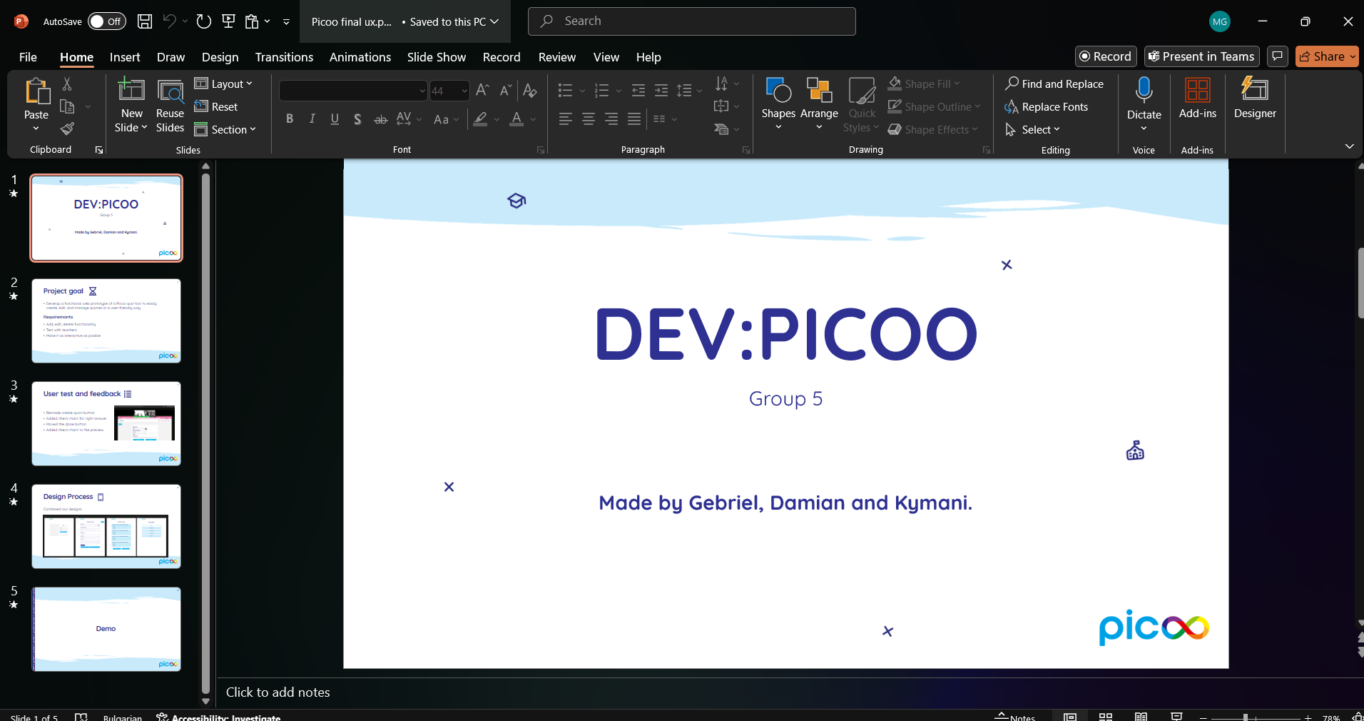
Project plan here
CREATETHATUX

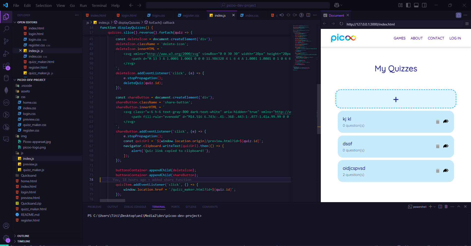
After completing the redesign we split the work and started working on the development. I created a git repository where we can store all the code that we write. My part was writing the JavaScript code for the functionality and creating the index page where the user can see all the quizzes they made and can create new ones. I decided to start working on the “back-end” part first so we can have a skeleton to build the design on in a separate branch. After that I coded the page that I was assigned and helped my teammates with whatever problems they ran into. The next step was to try and make the design consistent and looking like one whole thing.

We went to one of our teachers to ask him some questions and show him our progress. We asked about a functionality that we wanted to include - To be able to share a quiz - but we're not sure if we can make it work. The teacher told us that given the time that we have left and the fact that our product is almost finished we can try to include some different functions that would help us learn something new. I took his words into account and tried to code this functionality as fast as possible before a user test that we had previously scheduled. We also needed to recreate the pico home screen so that the user testing our product can go through all of the steps that would have to be done before creating the quiz.


We managed to add those features in time for the user test. Earlier the same day of the user test we went to another one of our teachers to give her a progress report and explain how everything works up till this moment. She gave us some tips for the user test like giving a good explanation of what the user needs to do so we can get the answers that we are looking for. The test went really well the user was very pleased with the experience and said there it's easy to navigate through the website. We did find some things that we need to tweak a bit like the button to create a new quiz to be more clear and also the way to mark a right answer for the questions. After fixing those things we were ready to present.

We made a short presentation for introduction stating what our goal was and what the requirements were, a bit of information about the user tests and some about the design process. After that we gave the clients a little demo of the finished product. They were pleased with the results and asked some questions about it like how the login works. I explained that we faked it and that every quiz is saved in the local storage. About the design they did have some notes, for example that the button to delete a quiz is too close to the share button and that might lead to miss-clicks. Also about the color of some buttons when hovered on is red which usually indicates removing something even if the button says done. Overall the comments were positive.


Finished product here