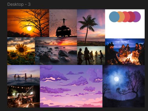
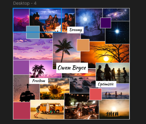
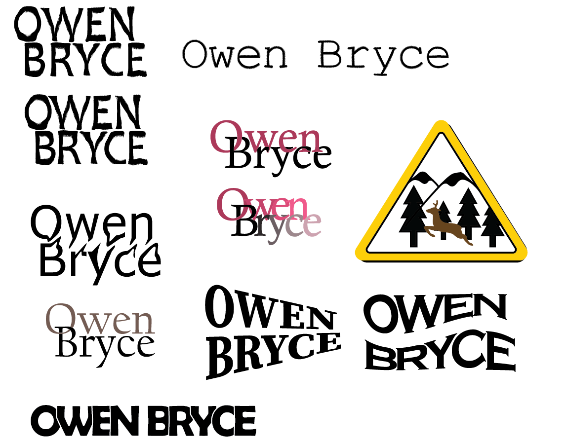
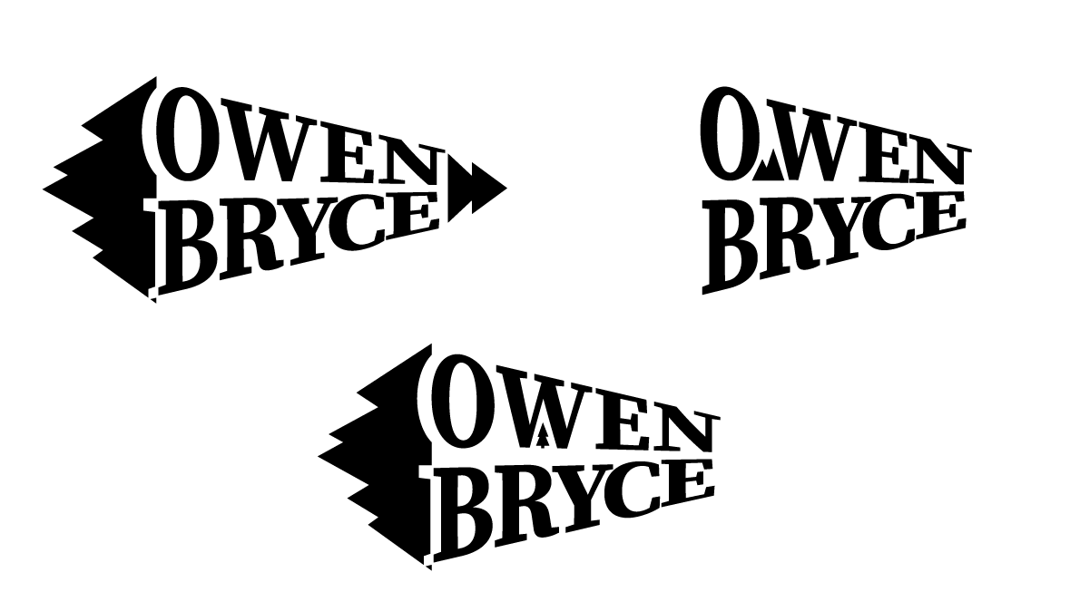
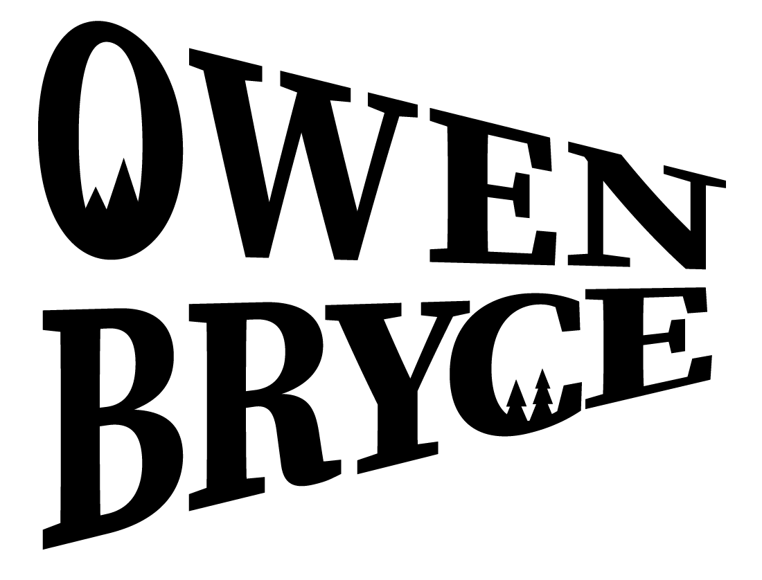
I made some logos for my client for the branding project. He sent some logos of different brands and artists that he enjoyed for the group to use as inspiration. I used Adobe Illustrator to make some logos myself and presented them to the client to get his opinion. He really liked one of them, so I focused on it and gave him some more variants. With a few more iterations I made the final logo he chose for the group to use. In the future I will definitely do some things differently. The group wasted too much time focusing on one specific task. After a talk with our teaches we came to the conclusion that the group as a whole gave the client too many options, which wasted a lot of time and made our job harder. For next time I would limit the options for the client with each iteration so the client could still feel in control but not waste too much time for us to focus on one task.
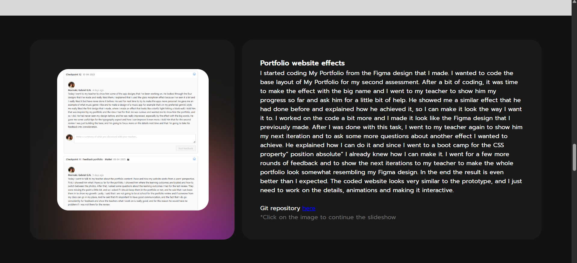
File with iterations and designs here
*Click on the image to continue the slideshow
I had a lecture about typography and the different fonts and typefaces we use. As an assignment we had to make some typography posters using Adobe Illustrator. At first, I had some ideas that I visualized but after that I had to look for some inspiration which was highly advised by the teacher. I found some really interesting posters online that I decided to recreate but also to add my own spin on. In the end I created some really cool posters that I am very proud of and also found some useful tools in Illustrator that I will for sure will use again. I talked with my teacher and showed him the work that I did. His feedback was, now that I have the skill I need to go bigger and find more techniques to incorporate in my work. This whole assignment taught me a lot and I would definitely use the skills I acquired in the future.
Zip with posters here
Me and my group had to perform a photoshoot for our client in the branding project. The website prototype we wanted to make for our client was mostly made up of photos and interesting typography, so we had to take some photos. The team and I booked a session for the MediaLab to do a test shoot to figure out how we are going to set the lighting and background. I learned a lot about the process of media production during this time. I took some photos that I am really proud of. After the session we sent the results to our client to get his opinion on them and received positive feedback, but we realized that we need more props for next time. We booked the MediaLab again for the actual photoshoot and performed the photoshoot. With the little knowledge we had from last time and the help of our teachers it was easier to work in the environment. In the end the client was quite pleased with the results and also my group has some really beautiful photos to use for the project.
All photos here
*Click on the image to continue the slideshow
I worked on my client's website prototype for the Branding project. We discussed with the client and one of my teachers the direction we wanted to go in with the website and we chose a simple, but effective look. At first, I made a mock-up using the photos we took from the test photoshoot to decide what the layout was going to be. After the group had the photoshoot with the client, he reviewed the photos and chose the ones he liked most. I used the layout I made before with the photos from the shoot again without fully editing them just to get an idea of what the end product is going to look like with Owen and sent it to him for feedback. He really liked the direction I went in but requested to add a merchandise section and also a section for his band. Also, he wanted to add a way to contact him and to add his socials to the footer. I got right on it and started editing the photos and making the sections he requested. In the end, the result was really pleasing, and I am very proud of what I did.
Figma prototype here
*Click on the image to continue the slideshow
Me and my group worked on creating mood boards for our client in the branding project. We decided that each member is going to create a separate mood board and we are going to send all of them to the client to see which one fits is the most with his style. This was the first mood board that I've ever created so I went online and looked at some inspiration for the look that I wanted to go for. I already had an idea for the style that I was going to use but I needed to figure out what the structure is going to be. After looking at some inspiration I tried making one motherboard but it didn't really look the way I wanted it to so I created a second one that I made more abstract which also matches with the style of the client. In the end we sent all the mood boards and the client liked two of designs made by my groupmates which we combined to make the mood board we ultimately went with. Even though the client didn't choose my design I'm proud of the mood board that I created.
Figma prototype here
*Click on the image to continue the slideshow
I started coding My Portfolio from the Figma design that I made. I wanted to code the base layout of My Portfolio for my second assessment. After a bit of coding, it was time to make the effect with the big name and I went to my teacher to show him my progress so far and ask him for a little bit of help. He showed me a similar effect that he had done before and explained how he achieved it, so I can make it look the way I want it to. I worked on the code a bit more and I made it look like the Figma design that I previously made. After I was done with this task, I went to my teacher again to show him my next iteration and to ask some more questions about another effect I wanted to achieve. He explained how I can do it and since I went to a boot camp for the CSS property” position absolute” I already knew how I can make it. I went for a few more rounds of feedback and to show the next iterations to my teacher to make the whole portfolio look somewhat resembling my Figma design. In the end the result is even better than I expected. The coded website looks very similar to the prototype, and I just need to work on the details, animations and making it interactive.
Git repository here
*Click on the image to continue the slideshow
For the development project me and my group had to write the code for the design we worked on in the “create that UX” project. After creating the base of our project we went to get some feedback from one of our teachers. We showed him our progress and he had some questions about the design choices we made like where the button to move to the next page was placed. We explained to him that it was still a work in progress and we are going to work on them for the next feedback. Next week we went back to our teacher to show him the changes we made. He was really pleased with the results we achieved. We talked about our plans for adding additional features like a “share quiz” option and asked what would be the best way to do it. He explained that given the time we have left he thinks we can make it fully functional. He also had some notes about the function to mark right answer and that it was a bit unclear. The “share quiz’’ option was my job so I worked on it after which it was time for our first user test. End the user test the participan.t was really pleased with our design but we did know this that she was struggling to understand whare button to create a new quiz Is so I made it more clear. After all these changes I think we have a pretty clear and understandable design that can be used even by people with less technical knowledge
Git to the project here
Finished product here
*Click on the image to continue the slideshow
I made some changes to the design of my portfolio website. During the portfolio review my teachers gave me some notes to include the files that I'm talking about in the proofs in the website and also to change the sections for the learning outcomes from professional and technical skills to just “learning outcomes” ( ). I took my time working on the changes in a separate branch after which I merged it with the main one. Afterwards I conducted a user test to see if the changes I made are well incorporated into the website and if anything else can be changed coming from a fellow student that hasn't seen My Portfolio before ( ). The user I tested gave me some notes about the links to my social media in the footer and that they don't work yet and also suggested to remove the scroll for more text in the hero section of the pages and only leave it in the index page ( ). After the redesign, I am happy with the results of My Portfolio and that I improved from the feedback I was given.
User test document here
*Click on the image links in the text to open a pop-up
For my project X I decided to recreate the popular online game Crossy Road. I managed to find a tutorial online to help me build the base of the game using the technology I wanted to incorporate (Threejs). I took my time working with the tutorial To create the foundation of the project ( ). After finishing the tutorial I noticed that there are some bugs like for example the fact that the player could move even after being hit by an obstacle or that the map was cut out, so I focused on fixing those mistakes. After that I really wanted to work on the character and obstacle models since they were pretty basic. I sketched out a prototype of how I wanted the models to look like ( ) after which I incorporated them into the game the best that I could ( ). Now the game looked better but I still need it to test it with users. I performed an observation user test ( ). And noticed that the user couldn't tell where the boundaries of the map were and that the random generator for the road lanes created too many roads which made the game quite hard. So I worked on making the boundaries more visible and putting a max cap on the road lanes ( ).
Tutorial I used here
User test file here
Git repository here
*Click on the image links in the text to open a pop-up
I made some changes in My Portfolio. After my last portfolio review the feedback that I got from my assessors were that the layout that I use for the website it's really limiting. Especially for one of the iterative process learning outcome it's hard to understand how the iterations go without being able to see the pictures clearly ( ). So I worked on the feedback and made two options for a small redesign of the layout of this specific learning outcome, one where the pictures are bigger but sit on top have the text ( )and the other where the pictures are incorporated into the text and the user can click on them while they're reading ( ). After doing that I went to my teachers to get some feedback from them and to see which of the two designs would be more understandable for them. Both of my teachers agreed that the design they like better is the second one. The initial idea I had was to link the pictures to a separate tab but one of the teachers suggested that I can make it into a pop up window without needing to open each picture in a different tab. I took his advice and made a pop up window where the user can even got through all of the pictures in this learning outcome ( ). I'm really happy with the results.
Git repository here
*Click on the image links in the text to open a pop-up
I had to work on designing a magazine. One of my teachers gave the class the assignment to work on a design for a magazine will represent some of our design work throughout the semester. I went online to look for some inspiration on how to structure the magazine content. While looking I found an example that really caught my eye( ) and decided to try to recreate it. I used Adobe InDesign to make the layout. After I was done with the initial layout it looked pretty similar to the example I found ( ) but I felt like there was something wrong with the width of the page so I went for some feedback from my teacher. He told me that I used a letter model to make the design and helped me change the scale so that it is 2 pages that are next to one another rather than one page that's cut in half. He also suggested that it would be better for me if I use the typography view rather than the one I was using before so I can see my options more clearly and make my job easier and also showed me some other tips and tricks. After the feedback session I went back to my seat and accidentally clicked the wrong key combination and lost everything that the teacher showed me. I was a bit frustrated but this was a great opportunity for me to see if I could now recreate everything that he showed me on my own. I also found another design that I used as inspiration to create two more pages ( ). I recreated it as well as I could and then remodeled my design based on the new layout and grid ( )( ). In the end I'm very proud of the results since this was the first magazine I've ever created and it was a really nice learning experience for me.
Magazine first iteration here
Magazine second iteration here
First inspiration here
Second inspiration here
*Click on the image links in the text to open a pop-up
I did some changes based on feedback for my Project X. After I was done working on the feedback I received from the first user test I went to my project mentor to show him my progress so far ( ). He suggested to add more features on top of the tutorial that are not only visual and ask me what my ideas were. Explained that I wanted to add a coin system and also another skin for the player to choose from. He liked those ideas and also suggested to add for example a feature where if the player escapes are moving obstacle very closely gains an additional point. I worked on adding these features next but I couldn't figure out how to do the skin feature since the character model always crashed the skin didn't fully change and the animations didn't work and then my last try the whole game just crashed ( ). I decided to focus on the other features which in the end I managed to add. I performed another user test to see how the new features work from an outside point of view and to maybe get some more suggestions ( ). The user test went well and the tester was not confused at all by the new features and didn't need an explanation on how things work. He gave me the suggestion to add a high score counter to keep track of the latest and highest score gained ( ). I worked on implementing that feature as a last touch and that concluded my work on the project ( ).
Finished product here
Git repository here
Trello board here
Conclusion file of second user test here
*Click on the image links in the text to open a pop-up
*You control the character with the arrow keys